Vacation Home Rentals
Rent your dream vacation home.
Context
The purpose of this project was to take a concept from a real startup and create a user interface which would best achieve the purpose of that startup. We followed the design flow from sketching, prototyping, critiquing, and user testing to create a final prototype which was sent to the actual startup.
Research
Vacation Home Rents is a vacation rental service that helps users find and compare rental options across listing websites. We designed a mobile app for this startup because the mobile format would make accessing the site easier and more convenient for users. We think that this interface will best serve users looking for a place to vacation who like to do their research before booking a rental and want to do so at the best rates available. The mobile format would also appeal to people away from their computer and out in public.
Designs
Sketches
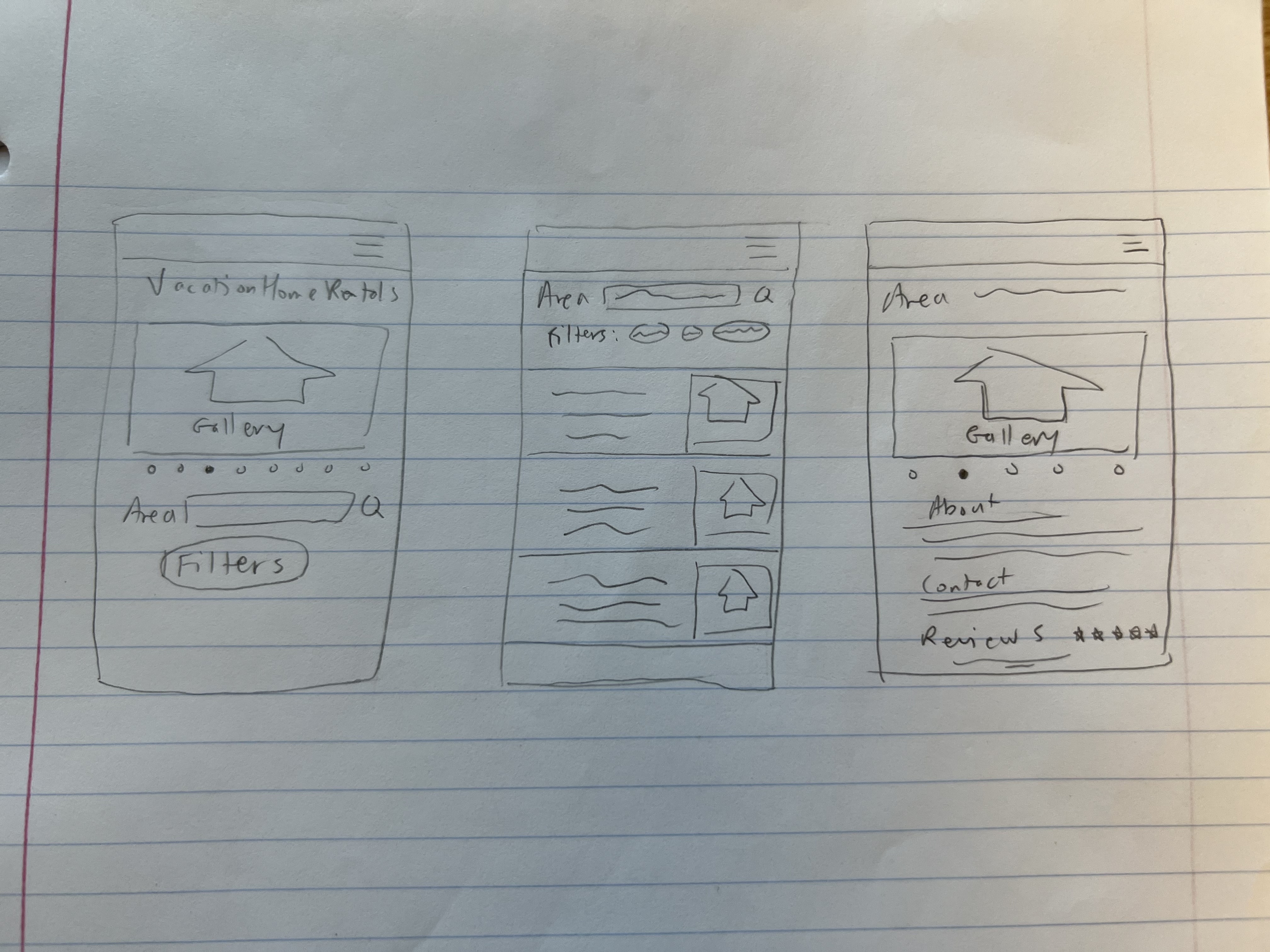
Each of us started the design process by individually sketching the core features and pages that are necessary for carrying out the vision of the startup. We then presented our designs to each other and chose parts that made sense to integrate into the interface.
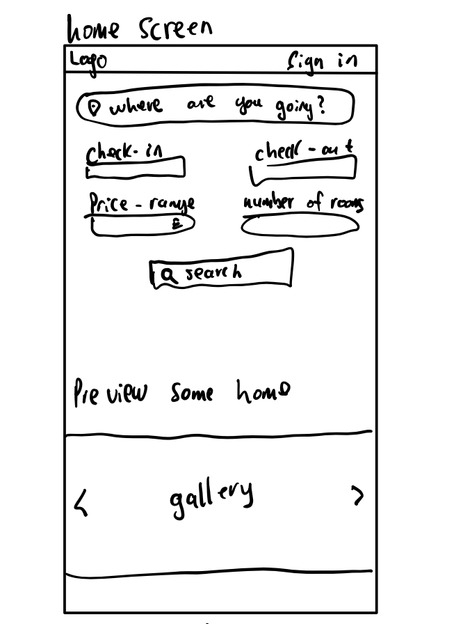
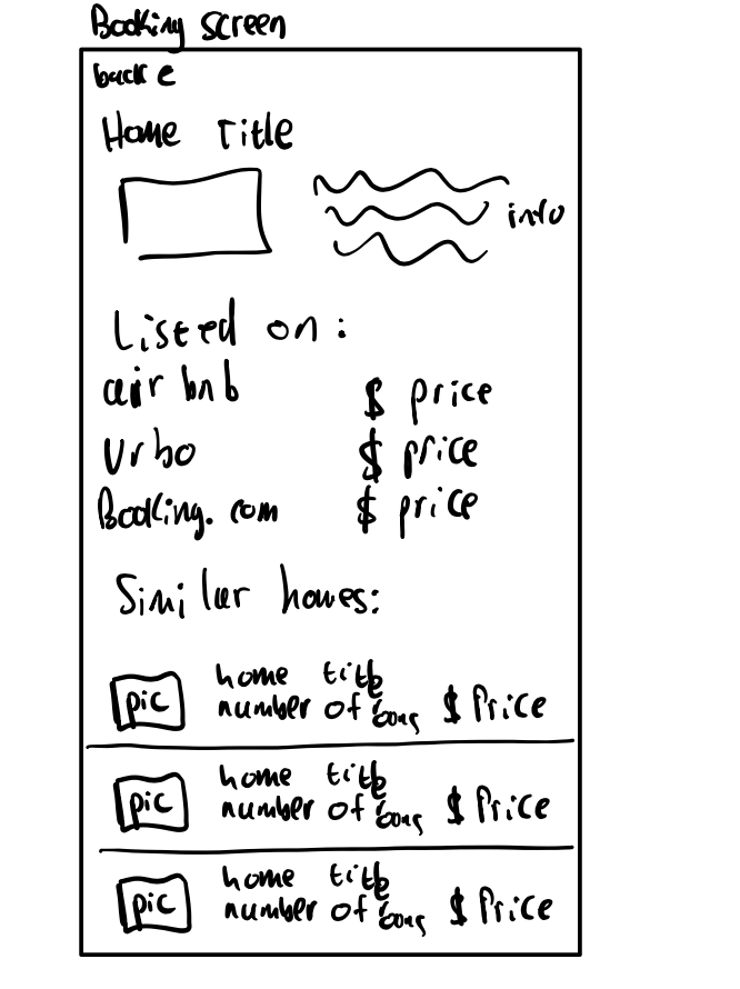
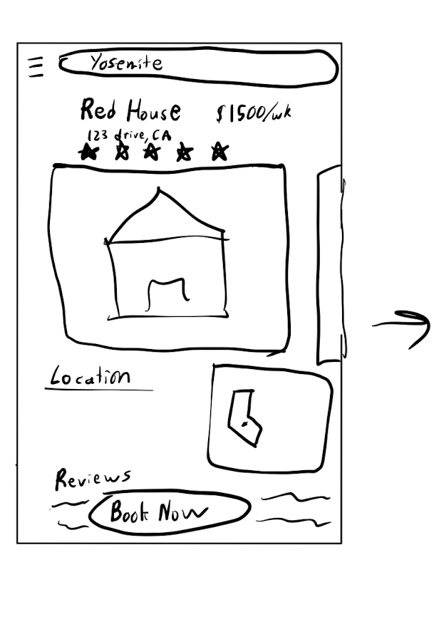
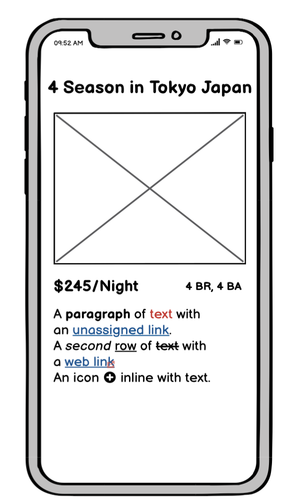
We liked how this sketch showed the information of the booking screen, which included info about the house, a picture, what sites has it listed, and similar homes.
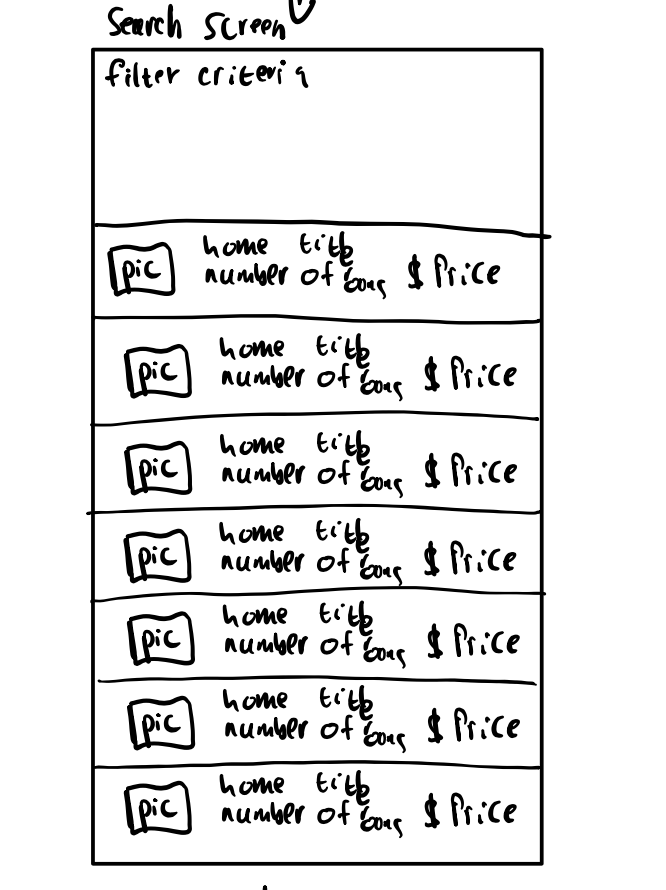
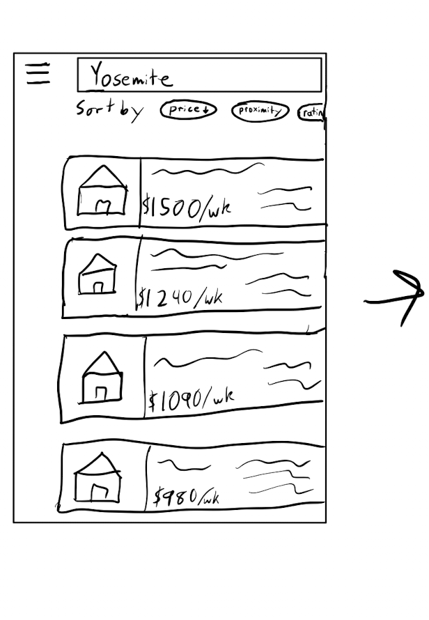
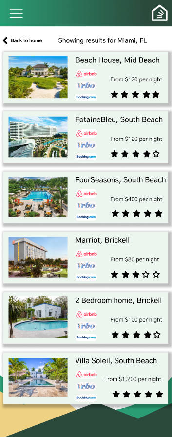
This sketch did a good job of showing how the search feature would work. It included filters, a search bar at the top, and listings of houses using a card style.
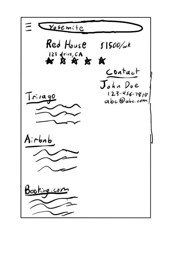
The format of the property information on this sketch had a good conceptual model for users.
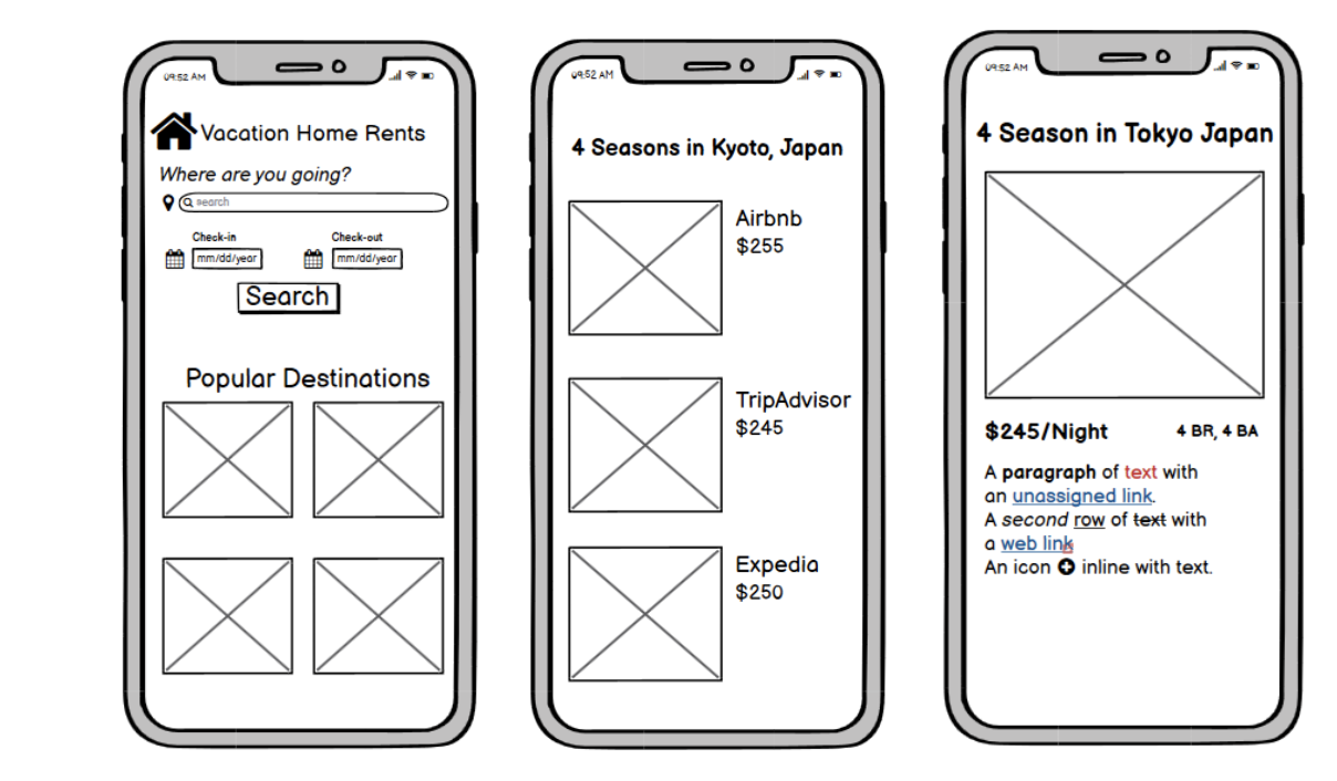
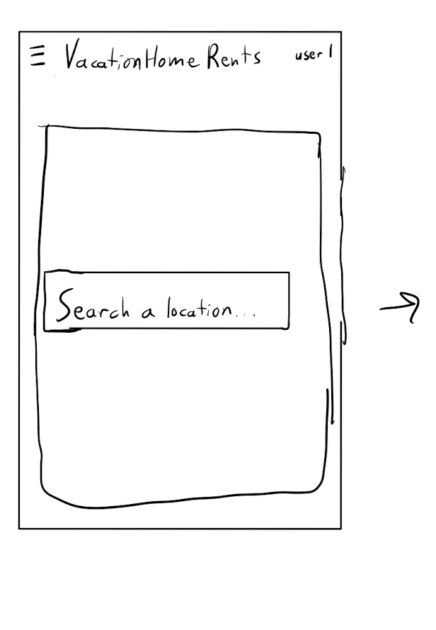
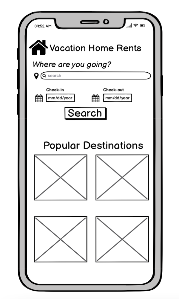
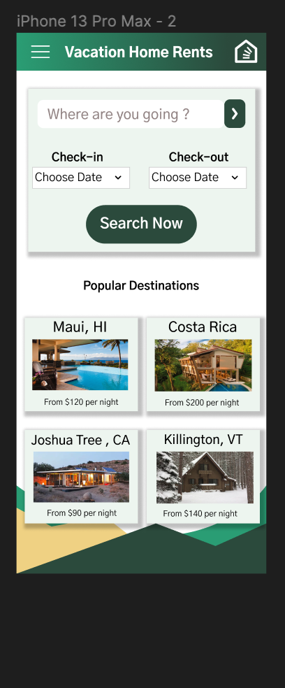
We liked how the home page of this sketch was set up. It also included a section for popular destinations in case you did not know exactly where to go.
The Prototypes
Lo-Fi Mockups
We developed our sketches into a low-fi prototype with the key features that we wanted to include.
Hi-Fi Mockups
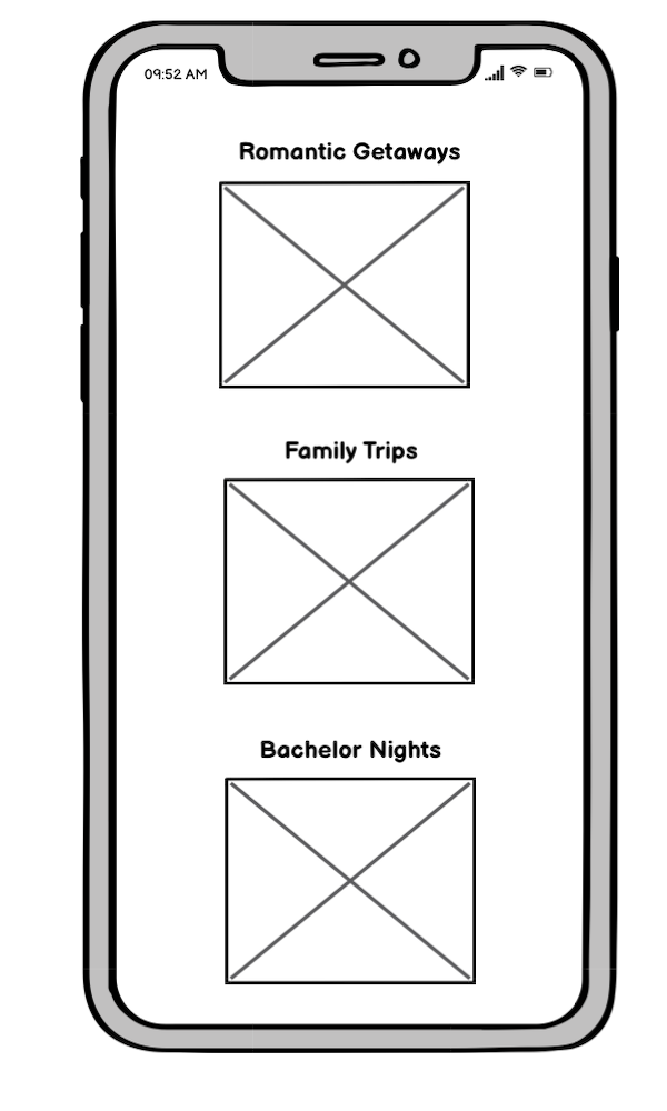
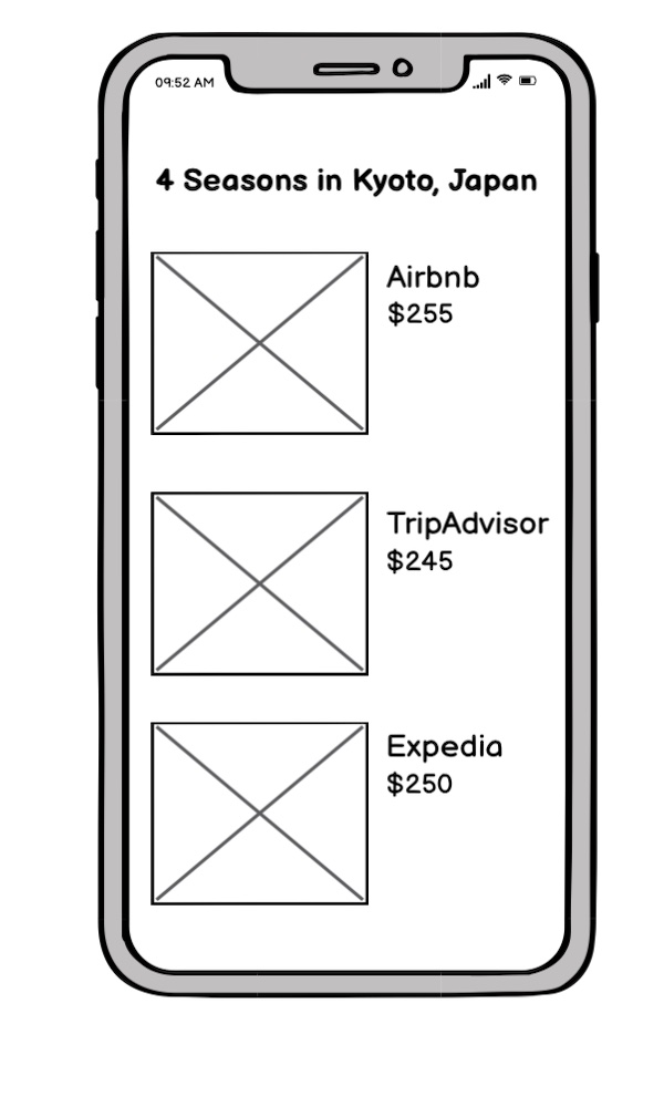
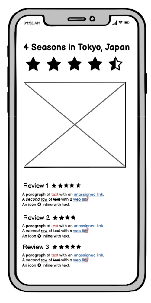
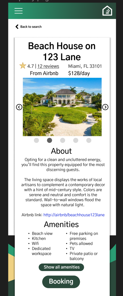
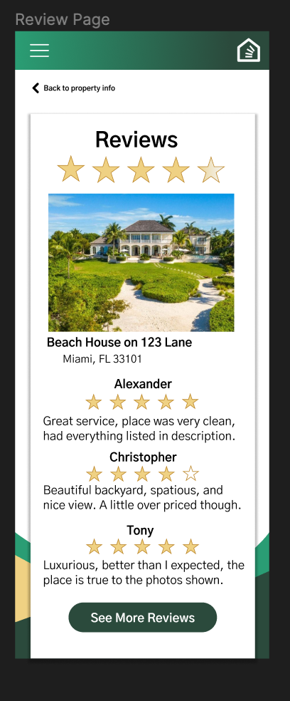
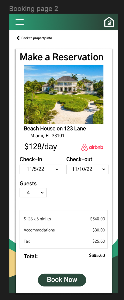
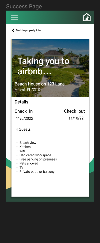
The low-fi prototype was used as a template to create the hi-fi prototype. The initial hi-fi prototype included a search page along with recommendations for places to travel. Upon searching for a location, it brings up a list of options based on listings from websites like Airbnb, Vrbo, and Expedia. Clicking on a website reveals information like the rating, reviews, accommodations, number of beds, and more. We also included a page where the user can view individual reviews. The booking process is as simple as selecting the move-in and move-out dates and number of guests. An estimated subtotal is automatically generated for the user, and the final step redirects the user to the actual booking site to finalize the transaction.
Critique
We presented our initial prototype to a panel of fellow classmates and an industry professional. Summarized below are the areas they said we could improve and what we did in response to their suggestions.
Areas Of Improvement
A lot of headings and subheadings look the same.
There is no search option at the top of the pages, and sorting functionality for the search was missing. Similar bookings sites also have filters for narrowing down results.
Boxes with drop shadow on the listings clutters the screen.
The top left navigation button did not work, and it was not clear what would be included in it. The home logo also had no functionality.
On the review page, the stars looked 3D and out of place with the rest of the site.
On the booking page, it would make sense if the checkout and booking button are always visible no matter where you scroll.
How We Improved
We modified the pages to follow a uniform hierarchy of text that clearly showed differences in font size and weight between each element type
We added the search bar back to the results page to allow users to easily change their search criteria. Sorting options by relevance, price, proximity, and rating we added to the results page. We also included forms on the home page search area for the checkin date, checkout date, and number of guests as filtering options.
The visual design of the listings on the results page was changed to be more simplistic without shadows. We added a little more space within each listing, taking full advantage of the scrolling ability of our mobile layout.
Because of the simplicity of the app, we did not think it was necessary to include the top left navigation button and removed it. We added functionality to the home logo by making it take you back to the home page when pressed. We also made it easier to get back to the home page by adding a button after the final booking to return.
We changed the star design to be uniform throughout the site and opted for a minimalistic black and white scheme.
This made a lot of sense to us as designers because we want to make spending money on the site as easy as possible. Thus, we fixed the book now button to always be at the bottom of the screen regardless of scrolling.
Final Prototype
User Testing
After modifying our prototype based on the feedback from the critique, we sent the prototype to a group of user testers and asked them to answer questions about the usability and design of the interface.
Questions
Imagine that you are trying to rent a vacation home. You are trying to rent a vacation home. You decide to go on this website that aggregates vacation rental homes and helps you book the cheapest one after having compared the prices at various sites. Try to book a vacation rental home. Think aloud as you do so as well.
1. Without leaving the home page, what are your initial impressions of the site?
2. What frustrated you most about the site?
3. How would you improve this site?
4. Do you know any companies or websites that are similar to this one? If so, explain how this one compares.
User Videos
Summary of User Responses
The users liked the color scheme of the website. It made them think of nature and relaxation.
They complemented how the home page was straightforward and not complex.
The users appreciated the different text sizes and hierarchy which helped them focus on the important features.
The users enjoyed how intuitive the flow of the prototype was.
One of the critiques on the prototype was that some of the vacation home pictures didn’t fully portray what the title labeled it as.
Also, the users questioned the text contents of the prototypes such as the fees and if all the fees were displayed or not.
Conclusion
Through this project, I learned how to test an interface and integrate user feedback into the design. I also became more familiar with prototyping in Figma. It was interesting to learn how users expect to have certain features of an interface if similar sites have them; for example, the ability to filter search results was something that many people wanted to have in the prototype. Even the placement of buttons and the order of content like pricing was important. If I were to continue this project I would most likely begin turning this into an actual app using Flutter and Dart or some other app development technologies. One important lesson I learned from this project is that the key to making your project better is to get other people to test your design because they will find problems that you might never have thought of yourself.