Craigslist
A long-awaited redesign.
Context
Craigslist has been around since the dark ages...
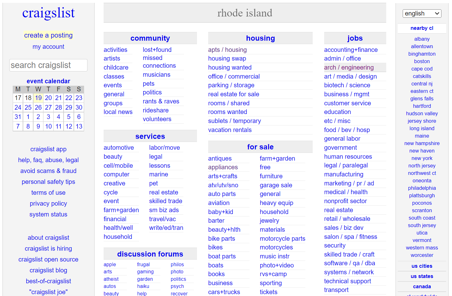
However, Craigslist has not gone through many updates and as a result, the interface is not very user-friendly.
Research
There are various accessibility issues with the craigslist website.
Accessibility Test Findings
Errors: 2
Errors: 2 Contrast Errors: 275
Errors: 2 Alerts: 57
There are also various other visual problems with the interface.
Observations
No pictures
All hyperlinks
No color
Too much text
Non-existent capitalization
Unnecessary information
And so, I decided to give it a little redesign...
Iterative Designs
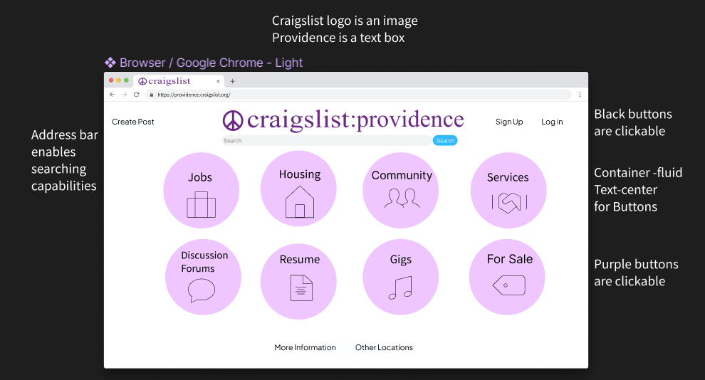
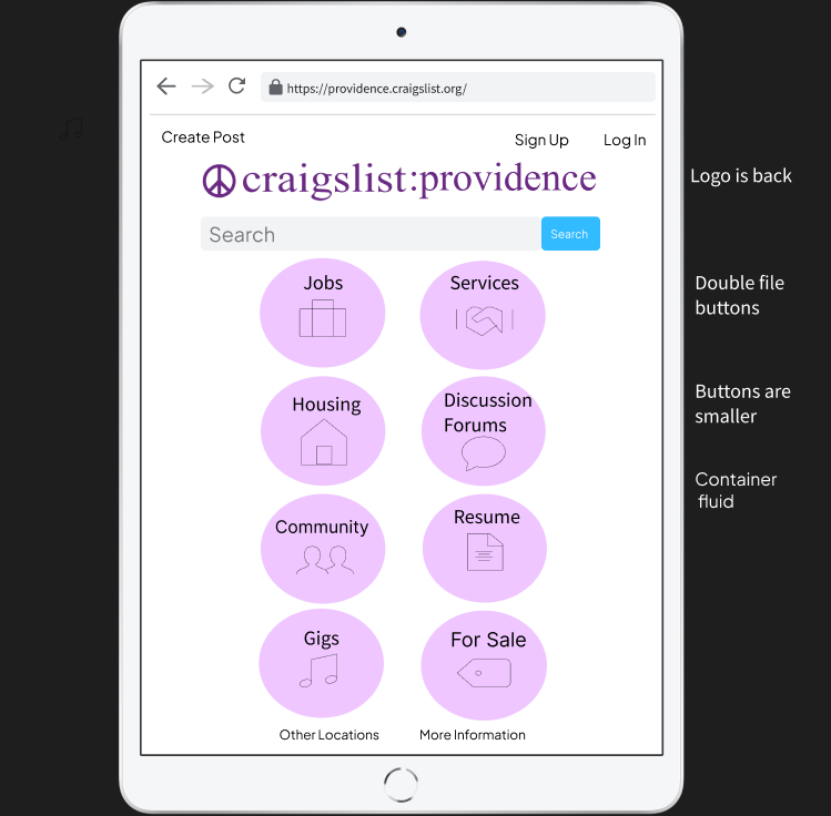
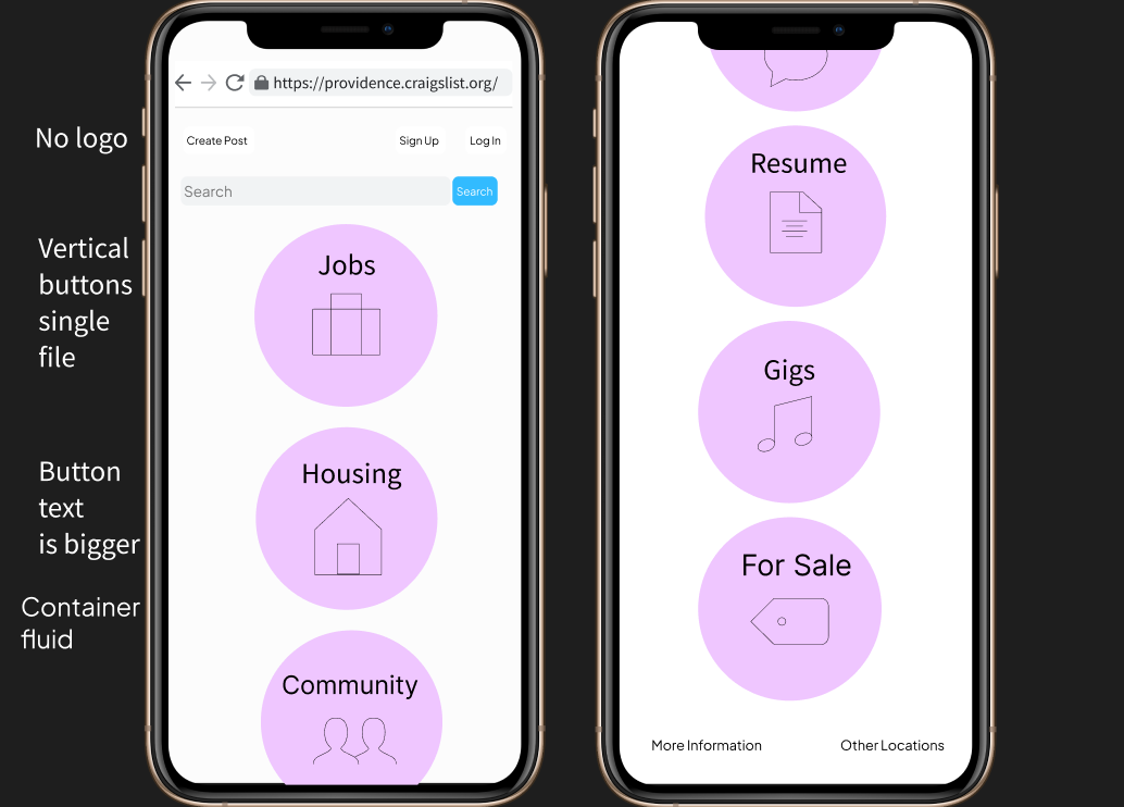
The Low-Fi Mockups
I used Balsamic to create the general layout of a new and improved version of Craigslist for various screen sizes.
Browser View
Tablet View
Phone View
Style Sheet
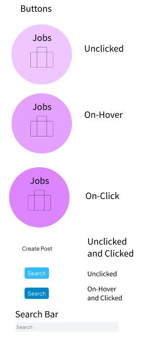
This was the style sheet I used for my High-Fi mockups.
The Prototype
Conclusion
I was able to successfully create a redesign that answers all the questions surrounding the accessibility of Craigslist. I made it much more simplified with the idea that everything should not be on one page. Rather, everything should be distributed among multiple pages so that everything is readable, less cluttered, and looks clean. If I were to continue this project even further, I would probably make it so that each of the categories in the circles have their own page. I learned a lot about designing and had to consider many factors when I was planning out the interface. But at the end of the day, the most important lesson that I learned from redesigning Craigslist is that more is not always better.